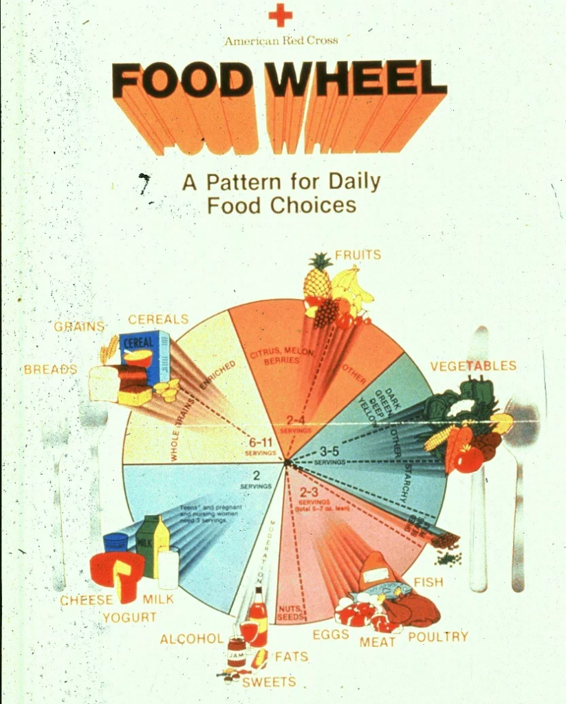
The food pyramid is a graphic representation of recommended daily food group proportions, once the primary visual tool for communicating nutrition guidance before being replaced by alternative formats in several countries. First introduced by Sweden in 1974 and adopted prominently by the United States Department of Agriculture in 1992, the pyramid organized food groups by recommended serving frequency, with grains at the wide base and fats and sugars in a narrow tip at top.
Structure and Evolution
The original 1992 USDA pyramid placed bread, cereal, rice, and pasta at its base, recommending six to eleven servings daily, with fruits and vegetables in the next tier, dairy and protein above that, and fats, oils, and sweets at the narrow top to be used sparingly. This emphasis on grains as a dietary foundation drew criticism from nutrition scientists who argued refined carbohydrates deserved less prominence than the pyramid suggested, and that the diagram oversimplified fat, lumping healthy and unhealthy fats together without distinction.
Replacement by MyPlate
In 2011, the USDA retired the food pyramid in favor of MyPyramid and then MyPlate, a simpler plate-shaped graphic dividing a dinner plate into proportional sections for vegetables, fruits, grains, and protein, with a separate dairy circle alongside. The shift reflected research suggesting a plate image maps more intuitively onto an actual meal than an abstract pyramid of food categories, making the guidance easier for the public to apply directly when assembling a plate of food.
Legacy and International Versions
Despite being officially retired in the U.S., the food pyramid remains widely recognizable and is still used in nutrition education in some other countries and contexts, including modified versions emphasizing physical activity or culturally specific food groups. Variants have been developed for vegetarian, Mediterranean, and other specific dietary patterns, each rearranging the same basic hierarchical structure to reflect a different set of dietary priorities and food availability.
Criticism of the Original Design
Nutrition historians have noted that the original 1992 pyramid’s emphasis on grains partly reflected agricultural policy interests as much as pure nutrition science, since wheat and corn producers had substantial influence over USDA guidance at the time. This criticism became a central argument for reform, with independent nutrition researchers publishing alternative pyramids, such as the Healthy Eating Pyramid from Harvard’s School of Public Health, which placed more emphasis on healthy fats and whole grains specifically rather than grains as an undifferentiated category.
Educational Legacy
Despite official retirement, the pyramid shape remains a common visual shorthand in nutrition education materials for children, textbooks, and public health campaigns in many countries, partly because the hierarchical structure intuitively communicates the idea of proportion even to audiences unfamiliar with detailed nutrition science. Some nutrition educators continue to debate whether a pyramid, plate, or entirely different visual metaphor best communicates dietary proportion to the public, with no single format having fully displaced alternatives worldwide.
Whatever shape ultimately proves most effective, researchers broadly agree that visual nutrition education tools work best when they are simple enough to recall quickly but detailed enough to meaningfully guide real food choices, a balance that has proven difficult for any single format, pyramid or otherwise, to fully achieve.
Alternative Visual Models
Beyond the plate and pyramid, some nutrition educators have proposed entirely different metaphors, including a staircase model emphasizing progressive dietary improvement rather than a fixed ideal, and simplified traffic-light color coding borrowed from front-of-package labeling systems, applying red, yellow, and green categories directly to food groups rather than individual nutrients. None of these alternatives has achieved the widespread recognition of the original pyramid or its plate successor, partly because changing an established, widely recognized visual symbol carries its own communication cost even when a new design might be more accurate.
Portion Guidance Within the Pyramid Era
The original pyramid era also struggled to communicate portion size alongside food group proportion, since recommending a number of daily servings meant little to consumers who did not have a clear sense of what a single standardized serving actually looked like on their own plate, a gap that later MyPlate materials attempted to close more directly through visual plate proportions rather than abstract serving counts.
Nutrition historians generally view the retired food pyramid not as a failure but as a necessary first step, one that introduced an entire generation to the basic idea of proportional food group thinking even though its specific internal hierarchy did not survive later scientific scrutiny intact.
Visual Literacy Across Age Groups
Nutrition educators have found that pyramid and plate graphics are generally more effective with younger audiences and those with lower health literacy than detailed nutrient tables, since a simple spatial metaphor requires less background knowledge to interpret correctly than numeric percent daily value figures, which partly explains why visual food group models have persisted in children’s nutrition education even as adult-facing guidance has grown more numerically detailed over the decades.
Museum and archival collections of historical nutrition education posters, including early pyramid designs, are now studied by food historians as a window into how public health communication strategies and underlying nutrition science assumptions have shifted across the twentieth and twenty-first centuries.
Nutrition science outreach programs aimed at general audiences continue to borrow the basic pyramid metaphor informally even decades after its official retirement, since the shape itself has become a kind of cultural shorthand for balanced eating that persists independently of any specific government agency’s current preferred format.
Regional school nutrition programs in several countries have begun piloting pyramid-free curricula entirely, instead teaching food relationships through hands-on cooking and gardening activities, an approach early research suggests may build more durable food literacy than memorizing any single static diagram, pyramid or otherwise.
Key facts
- The food pyramid was introduced by Sweden in 1974 and popularized by the USDA in 1992.nGrains formed the base, with fats and sweets at the narrow top.nThe USDA replaced the pyramid with MyPlate in 2011.nThe pyramid remains in use in modified forms in some countries.
Quick checkWhat replaced the USDA food pyramid in 2011?Show answer
The USDA replaced the food pyramid with MyPlate, a plate-shaped graphic dividing a meal into proportional food group sections.
Sources
- USDA MyPlate history, Dietary Guidelines for Americans
Editorially reviewed by Specialty Digest Editorial TeamLast reviewed November 3, 2026Researched and drafted with AI assistanceReport an issue