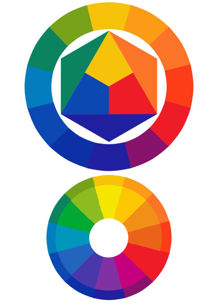
Color theory is the body of practical guidance and principles that explains how colors relate to one another, how they can be combined to create visual harmony or contrast, and how viewers perceive and respond to different color combinations. Artists and designers use it to make deliberate decisions about palette rather than choosing colors arbitrarily, drawing on both the physics of how light and pigment behave and centuries of accumulated observation about which combinations tend to read as pleasing, jarring, energetic, or calm.
From Newton to the modern color wheel
Formal color theory traces back at least to Isaac Newton’s 1704 book Opticks, which grew out of his experiments splitting white light into a spectrum of colors using a prism and sparked a lasting debate over how many fundamental colors exist and how they should be organized. Newton arranged the spectrum’s colors into a circular diagram, an early color wheel, establishing the idea that colors could be organized spatially according to their relationships to one another rather than simply listed. Later theorists refined and reorganized this basic circular model repeatedly over the following centuries as scientific understanding of light and human color perception advanced.
Goethe’s rival theory
Not every early color theorist agreed with Newton’s purely physical account. The German writer and polymath Johann Wolfgang von Goethe published his own Theory of Colours in the early nineteenth century, arguing that Newton’s physics-based approach ignored the psychological and perceptual dimension of how humans actually experience color, including the emotional associations and optical illusions color can produce. Goethe’s theory had less lasting influence on the physics of light than Newton’s, but it helped establish color perception and color psychology as a legitimate area of study in its own right, a thread that later color theorists, including those working in art and design education, continued to build on alongside the physical science Newton had established.
Primary, secondary, and complementary colors
Most practical color theory used in art and design today is built around primary colors, typically red, yellow, and blue in traditional pigment-based theory, which cannot be created by mixing other colors together and which combine in pairs to produce secondary colors such as orange, green, and purple. Mixing a primary color with its neighboring secondary color produces a tertiary color, filling out a twelve-part wheel that maps the full range of hues in a systematic, evenly spaced arrangement. Colors positioned directly opposite each other on the wheel are called complementary colors, such as red and green or blue and orange, and placing complementary colors next to each other creates strong visual contrast and makes each color appear more vivid, a relationship color theory identifies as one of its most reliable and widely used tools.
Itten’s color wheel and the Bauhaus
The Swiss artist and educator Johannes Itten, who taught at the influential Bauhaus design school in Germany, developed an especially widely used twelve-part color wheel and an accompanying body of teaching built around systematic color relationships, published in his book The Art of Color in 1961. Itten’s approach to color theory became foundational to design education throughout the twentieth century, emphasizing structured exercises in contrast, such as contrasts of hue, value, saturation, and simultaneous contrast, where two colors placed next to each other visually alter how each one is perceived, training students to see and control these interactions deliberately rather than relying on intuition alone.
Warm and cool colors, and color harmony schemes
Colors are commonly divided into warm colors, such as reds, oranges, and yellows, which tend to feel energetic, advancing, or associated with heat and sunlight, and cool colors, such as blues, greens, and purples, which tend to feel calm, receding, or associated with water and shade, though this association is a learned cultural and psychological pattern rather than a fixed physical property of the colors themselves. Beyond the basic complementary relationship, designers commonly build a palette around other recurring color harmony schemes, including analogous schemes using colors that sit next to each other on the wheel for a cohesive, low-contrast look, and triadic schemes using three colors evenly spaced around the wheel for a balanced but more vibrant combination than an analogous scheme typically provides.
Color theory in practice
Beyond fine art, color theory underpins decisions across graphic design, branding, interior design, and fashion, since a logo, a product packaging scheme, or a room’s paint palette all rely on the same underlying principles of contrast, harmony, and perceptual effect that artists have studied for centuries. Designers frequently test color combinations against specific practical goals, such as ensuring sufficient contrast for text readability or choosing a brand’s primary color to evoke a particular emotional association, applying color theory’s general principles to highly specific commercial and communicative purposes rather than purely aesthetic ones.
Limits of color theory
Color perception and preference are also shaped by individual variation, including color vision differences, and by cultural context, since the symbolic meaning attached to a given color, such as which colors signal mourning, celebration, or danger, varies considerably across different societies and historical periods. This means color theory’s general rules about contrast and harmony function as a reliable practical toolkit rather than fixed laws guaranteeing a particular emotional response in every viewer, and skilled designers and artists frequently adapt or deliberately break standard color theory conventions when a specific creative or communicative goal calls for it.
FAQs
Are red, yellow, and blue universally recognized as the primary colors? They are the traditional primary colors in pigment-based, subtractive color mixing used in painting and printing, but light-based, additive color mixing used in screens and digital displays instead uses red, green, and blue as its primaries, so which colors count as primary depends on the specific medium and mixing method being used.
Who created the most widely used modern color wheel? Several theorists contributed over the centuries, but the Swiss Bauhaus educator Johannes Itten’s twelve-part color wheel, published in his 1961 book The Art of Color, became especially influential in modern art and design education.
Key facts
- Traces to Isaac Newton's 1704 Opticks and his circular color diagram
- Johannes Itten's 12-part wheel (The Art of Color, 1961) became foundational in design education
- Complementary colors sit opposite each other on the wheel
- Pigment primaries (red/yellow/blue) differ from light/screen primaries (red/green/blue)
Related concepts
Quick checkAre red, yellow and blue universally the primary colors?Show answer
Only in pigment-based mixing; light-based/digital displays use red, green and blue as primaries instead.
Sources
- Knowt. Exhaustive Overview of Color Theory: History, Science, and Design Principles. https://knowt.com
Editorially reviewed by Specialty Digest Editorial TeamLast reviewed November 1, 2026Researched and drafted with AI assistanceReport an issue