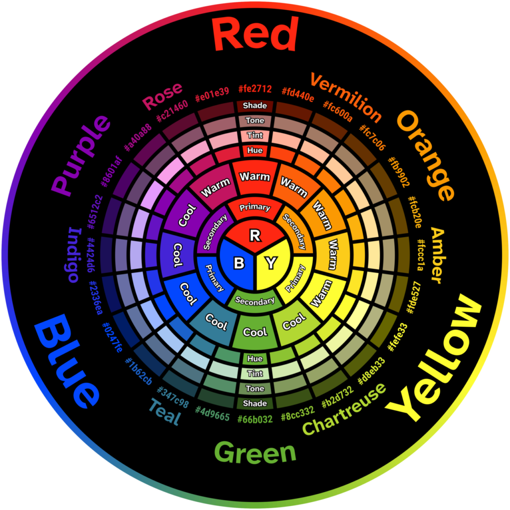
A color wheel is a diagram, used mainly in the visual arts, that arranges colors around a circle to show how they relate to one another. Artists in painting, fashion, film and design use it to build color schemes.[1] People asking what is the color wheel usually want to know how colors work together. Colors that sit next to each other look alike, and colors that sit across from each other contrast.
The best-known version is the traditional art wheel, built on red, yellow and blue. It is one of several competing models. The red-green-blue model of light and the cyan-magenta-yellow model of printing each organize color differently, and each fits a different purpose.[1][2] The wheel is a teaching and planning tool, not a law of nature.
| Purpose | Shows how hues relate, to plan color schemes |
|---|---|
| Traditional primaries | Red, yellow, blue (RYB) |
| Secondary colors | Green, orange, violet |
| First published wheel | Isaac Newton, Opticks, 1704 |
| Complementary pair example | Red and green on the RYB wheel |
Structure of the wheel
Primary, secondary and intermediate colors
In the red-yellow-blue (RYB) model, the three primary colors cannot be made by mixing other hues. Mixing two primaries gives a secondary color: green from yellow and blue, orange from yellow and red, and violet from blue and red.[1] Mixing a primary with its neighboring secondary gives a third tier. Britannica calls these intermediate colors and lists vermilion (red-orange), amber (yellow-orange), chartreuse (yellow-green), teal (blue-green), indigo (blue-violet) and magenta (red-violet).[1] Many art teachers call the same tier tertiary colors. Together the three tiers make the familiar 12-hue wheel.
Why the primaries differ between models
No single set of primaries works for every medium. Britannica distinguishes two kinds of mixing. In additive mixing, colored light combines before it reaches the eye, so equal red and green light produces yellow. In subtractive mixing, pigments and filters absorb some wavelengths and reflect the rest, so mixtures get darker as more are added.[2] The RGB model used by screens is additive. The cyan-magenta-yellow (CMY) model used in printing, and the RYB model, are subtractive.[2]
Britannica describes RYB as the oldest and most accessible model, likely known to artists since ancient times and widely taught in classrooms.[2] CMY produces a larger range of mixtures than RYB. A teaching resource from RMIT University describes the RGB wheel as the more accurate modern model, chosen because its primaries provide the greatest color gamut in mixtures, and notes that RYB is still used in some contexts to teach color mixing in the visual arts.[3]
The physiology behind RGB is well established. Thomas Young proposed in the early 19th century that the eye perceives color through three kinds of receptors. About 50 years later, Hermann von Helmholtz suggested that they respond to short, medium and long wavelengths, which correspond roughly to blue, green and red. In 1861, James Clerk Maxwell demonstrated the principle with what is often called the first color photograph, made by projecting three black-and-white photographs taken through red, green and blue filters.[2] For a related concept, see the entry on wavelength.
Color relationships
Complementary colors
Britannica defines complementary colors as a pair that sit opposite each other on the traditional wheel.[4] Each primary has a complement made by mixing the other two primaries: the complement of red is green, which is blue mixed with yellow. A primary’s complement is therefore always a secondary, and a secondary’s complement is always a primary.[1][4]
When complementary colors sit side by side, each looks more intense. The 19th-century chemist Michel-Eugène Chevreul called this the law of simultaneous contrast, and the Royal Society awarded him its Copley Medal in 1857.[4][5] RMIT’s account adds that Chevreul reached the idea while studying dyes for carpet manufacture, and concluded that color perception is relational: a color looks different depending on what lies next to it.[6]
Analogous colors
Analogous colors are neighbors on the wheel, such as blue, blue-green and green. Britannica says they create cohesion and harmony.[1]
Other schemes
Designers extend these two ideas into other schemes. A triadic scheme uses three hues spaced evenly around the circle. A monochromatic scheme varies a single hue by lightness and intensity. These layouts are conventions of design practice, not measurements, and their results depend on the proportions in which colors are used. Johannes Itten, who taught at the Bauhaus, listed seven kinds of contrast that a designer can exploit: hue, light-dark, cold-warm, complementary, analogous, saturation and extension.[7]
These ideas apply across fine art, graphic design and information design, where the contrast between colors also affects how legible a chart or sign is. The broader field is covered in the entry on color theory.
History of the color wheel
Newton’s circle
Britannica states that Isaac Newton was the first to arrange colors into a wheel, in Opticks in 1704, after prism experiments in which he identified seven colors in white light: red, orange, yellow, green, blue, indigo and violet.[1] A Cambridge University Library blog is more cautious, saying he is widely thought to be the first to show a bar of colors in circular form.[8]
According to the Royal Society, Newton had published his theory of light and colors in Philosophical Transactions in 1672 after his “crucial experiment” with a prism. Opticks appeared more than 30 years later and contained the first color wheel. It divided the circle into seven segments of unequal size, based on the pattern of the musical scale.[5] In 1719, the mathematician Brook Taylor suggested that Newton’s circle could guide the mixing of paints, even though Newton’s theory concerned light rather than pigment.[5] The same spectrum underlies natural phenomena such as the rainbow, explained in the article on why rainbows are curved.
Eighteenth and nineteenth centuries
Later makers redesigned the wheel for pigments and for perception. The Public Domain Review lists a shaded wheel by the English entomologist Moses Harris in The Natural System of Colours (1766), a wheel by Ignaz Schiffermüller in Versuch eines Farbensystems (1772), a six-color circle by Johann Wolfgang von Goethe (1809), Philipp Otto Runge’s color sphere (1810) and Wilhelm von Bezold’s color chart (1874).[9] The Cambridge post describes Schiffermüller’s wheel as having 12 continuous colors. It describes Runge’s sphere as placing pure colors around the middle, white at the top, black at the bottom and gray at the core.[8]
Goethe’s circle is symmetrical, with three primary and three secondary colors, and ties color to human experience rather than physics. The Royal Society notes that his science was later disputed, and Britannica says modern physics does not accept his theory that color arises from the interaction of light and darkness.[1][5] Chevreul devised a 72-color wheel in 1839.[6]
Wheels of light and solids of color
The physicist Ogden Rood developed what the Cambridge post calls the first wheel based on red, blue and green light rather than pigments.[8] Rood published Modern Chromatics, with Applications to Art and Industry in 1879, proposing that small dots of different colors blend into a new color when viewed from a distance, an idea that influenced Impressionist painters and pointillists such as Georges Seurat.[6] For the art movement, see the entry on Impressionism.
The wheel also grew into three dimensions, because a flat circle cannot show lightness or intensity. Bezold imagined a cone with ten divisions, and the chemist Wilhelm Ostwald built a system on four fundamental colors subdivided into 24 hues.[8] Ostwald, a Nobel Prize-winning chemist, sought a scientific theory of why some color combinations look pleasing, and published The Colour Primer around 1916.[6]
Munsell and Itten
Albert Henry Munsell (1858-1918), a painter and art teacher, began after reading Rood by devising color pyramids in 1879. In 1905 his book A Color Notation adopted a tree model, with hue and chroma on the branches and value on the trunk. The Atlas of the Munsell Color System (1915) replaced the tree with cross-sectional charts.[10] The system describes each color by three attributes: hue, value (lightness, from white to black) and chroma (intensity). Munsell used five principal hues, red, yellow, green, blue and purple, which challenged the traditional red-yellow-blue primary theory.[10] The Cambridge post notes that his circle had 10 divisions, which could be subdivided into 100 hues.[8] RMIT calls it still one of the most widely used color systems, especially in design.[6]
At the Bauhaus, Itten’s 1921 “color star” reinterpreted Runge’s sphere as a flattened diagram with twelve pure colors in an equatorial zone, and became the basis of color instruction in the school’s Preliminary Course.[7] The Bauhaus approach had students explore color through contrasts and polarities.[7]
Limits of the wheel
The wheel simplifies. Because CMY produces a larger range of mixtures than RYB, the traditional primaries cannot mix every color, and a modern printer or screen works from a different set.[2] The wheel also says nothing about the cultural meanings of color.
FAQs
What are the primary colors on a color wheel? On the traditional art wheel they are red, yellow and blue, which cannot be made by mixing other hues. Wheels based on light use red, green and blue, and printing uses cyan, magenta and yellow.
What are complementary colors? They are colors directly opposite each other on the wheel, such as red and green on the RYB wheel. Placed side by side, each looks more intense.
What are analogous colors? They are neighbors on the wheel, such as blue, blue-green and green, and they tend to look cohesive and harmonious.
Who invented the color wheel? Britannica credits Isaac Newton, in Opticks in 1704, with the first wheel. Many later designers, including Schiffermüller, Goethe, Chevreul, Rood and Munsell, made their own versions.
Why do some wheels use red, green and blue? Those wheels describe mixing light, which is additive. They match how the eye detects light, and they give a larger color range than red, yellow and blue.
What are intermediate or tertiary colors? They are made by mixing a primary with its neighboring secondary, such as red-orange or blue-green.
More in Science
- color wheel, Encyclopaedia Britannica
- primary color, Encyclopaedia Britannica
- Additive and subtractive colours on the colour wheel, RMIT University, Colour Theory
- complementary color, Encyclopaedia Britannica
- Colour wheel, The Royal Society blog, 2021
- Modern era (c. 1850 to 1980), RMIT University, Colour Theory
- Form and color at the Bauhaus, Getty Research Institute
- Reinventing the colour wheel, Cambridge University Library language collections blog, 4 January 2019
- Colour Wheels, Charts, and Tables Through History, The Public Domain Review
- Atlas of the Munsell Color System (1915), The Public Domain Review
Photo: Revulo.Studio / Wikimedia Commons / CC0